Opening Hook
For a while, my workflow for this project looked like a familiar research loop: edit a parameter in code, launch a batch run, wait for the results, open a static figure, and try to reconstruct what had just happened. That workflow was productive, but it had a hard ceiling. It could tell me what the model produced. It was much worse at helping me inspect why a pattern emerged, what assumptions shaped it, and how I could explain the result to someone who had not lived inside the codebase.
That gap matters more than it sounds. Agent-based modeling is not only about computation. It is also about making mechanism legible. In an earlier essay, Simulating Society in the Age of AI, I described this as a version of “making the invisible visible”: not just plotting outcomes, but exposing how rules, parameters, and interpretation pathways fit together. Once I started treating the interface itself as part of the research instrument, the dashboard stopped being a presentation layer and became part of the methodology.
That shift shaped the design of The Convenience Paradox, my small personal test project on GitHub. Rather than treating the interface as a finished product, I approached it as a useful prototype: an attempt to build a research-facing layer on top of the simulation for configuring experiments, running them interactively, comparing runs, annotating results, and interrogating the model with LLM assistance without giving up the white-box logic of the ABM core. What emerged is a four-page Dash application that, while still exploratory in spirit, points toward one idea I want to keep developing: a good interface should not hide complexity. It should help researchers navigate it.
Core claim: In this project, the interface is not just a presentation layer. It is part of the research instrument.
Architecture: The Interface as Research Infrastructure
This interface is a small multi-page Plotly Dash prototype with four pages: Simulation Dashboard, LLM Studio, Run Manager, and Analysis. The design is easiest to understand as two layers.
The first is the visible application layer: Dash provides the shell, navigation, and interaction model; Plotly provides the charts; SQLite preserves runs for later comparison. This is the part the user touches directly.
The second is the shared control layer behind it: server-side state keeps the current simulation alive, small browser stores coordinate page interactions, and Python callbacks connect the interface directly to the Mesa model and the LLM service. That keeps the whole system in one coherent workflow instead of splitting it into disconnected tools.
The architecture diagram below shows that structure in concrete terms: interface on top, control and state in the middle, and simulation, LLM, and persistence services underneath.
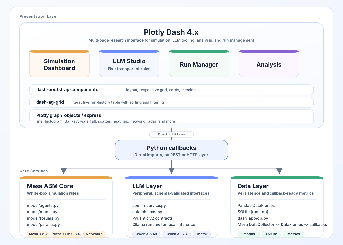
The concrete diagram maps directly onto the implementation. The abstract sketch below complements it by showing the same system at the level of design logic: model at the core, interface around it, and provenance connecting the layers.
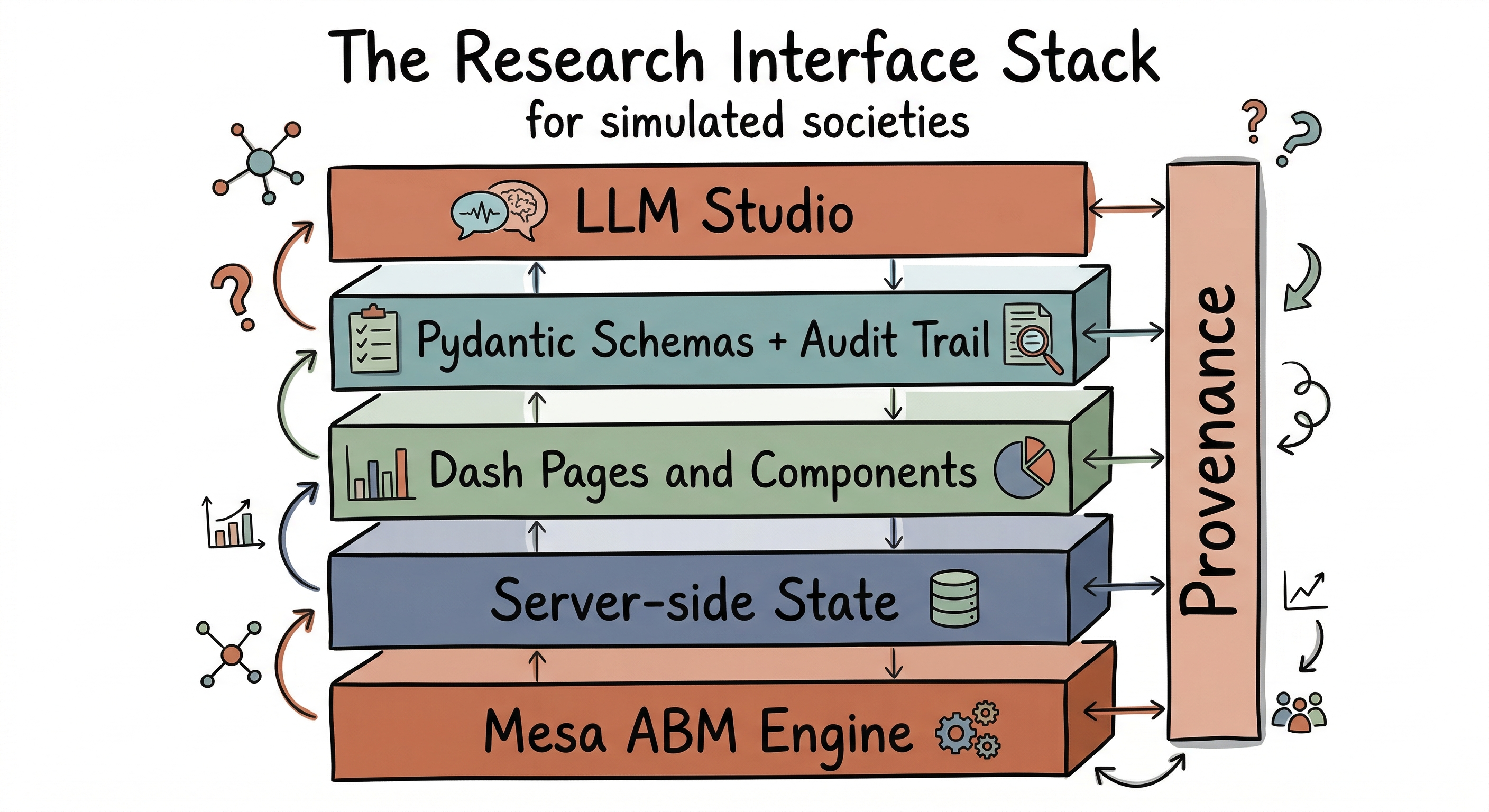
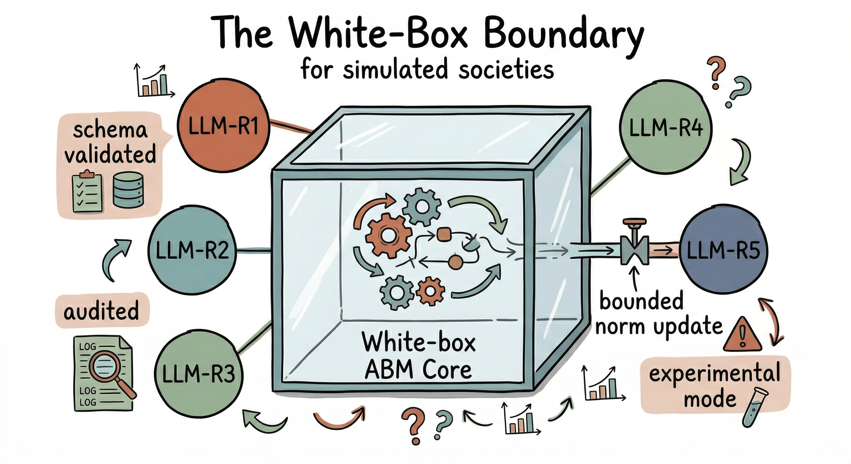
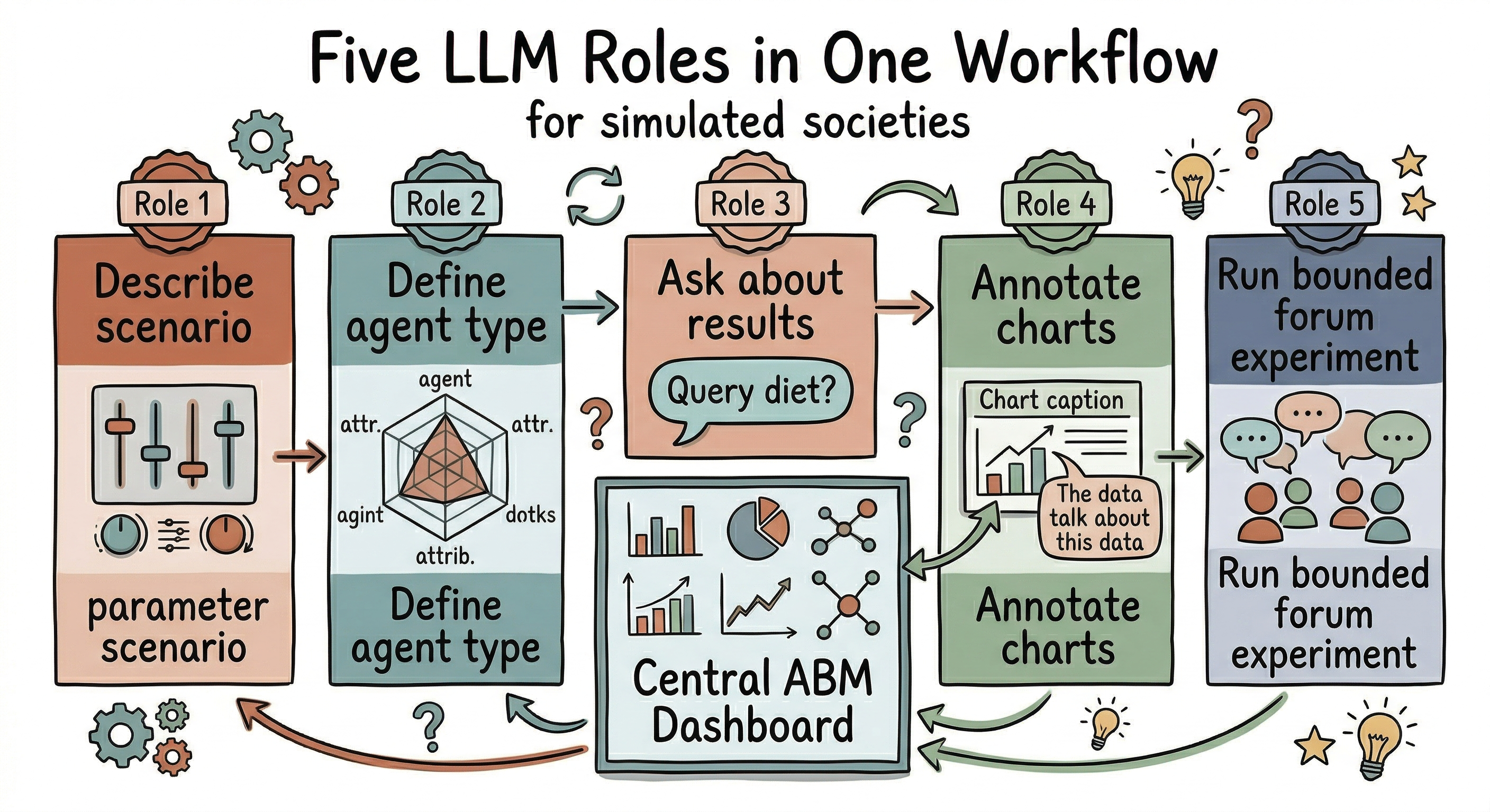
What makes the architecture distinctive is LLM Studio. Instead of adding one generic chatbot, the interface separates five roles: scenario design, profile generation, result interpretation, chart annotation, and bounded forum experiments. This makes the LLM layer feel less like a gimmick and more like a set of research tools with different jobs.
Just as importantly, those roles do not all sit in the same place. Most stay at the model’s edges: they help configure, explain, or annotate. Only the forum mode enters the simulation loop, and even there the interface makes the boundary explicit through experimental labeling, short exchanges, capped updates, and auditability. That is the core architectural idea: the LLM is used as an interface layer around a transparent model, not as a hidden substitute for it.
Architectural boundary: The LLM sits around a white-box model by default. Only forum mode enters the loop, and even there the intervention stays explicit, bounded, and auditable.
Feature Showcase: A Quick Tour of the Interface
Before diving into the LLM layer, it helps to see the rest of the workbench in motion.
Simulation Dashboard
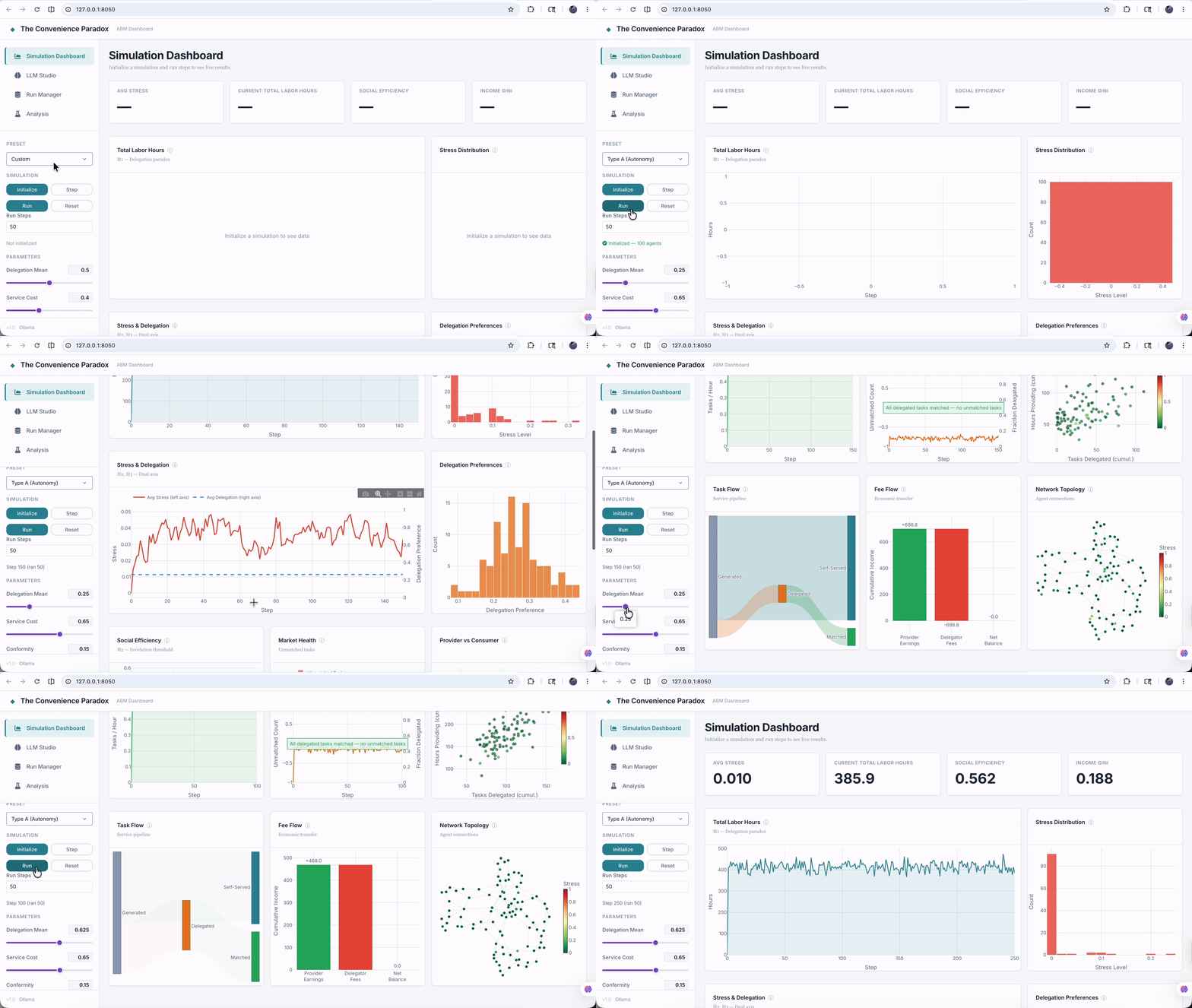
The landing page is the operational center of the simulation. It combines parameter controls, preset switching, run actions, KPI cards, and a broad set of Plotly views: labor hours, stress and delegation, market health, provider-consumer stratification, task flows, and network topology. The goal is not just to show a few pretty charts. It is to let a researcher adjust assumptions and immediately see how the system responds.
Run Manager
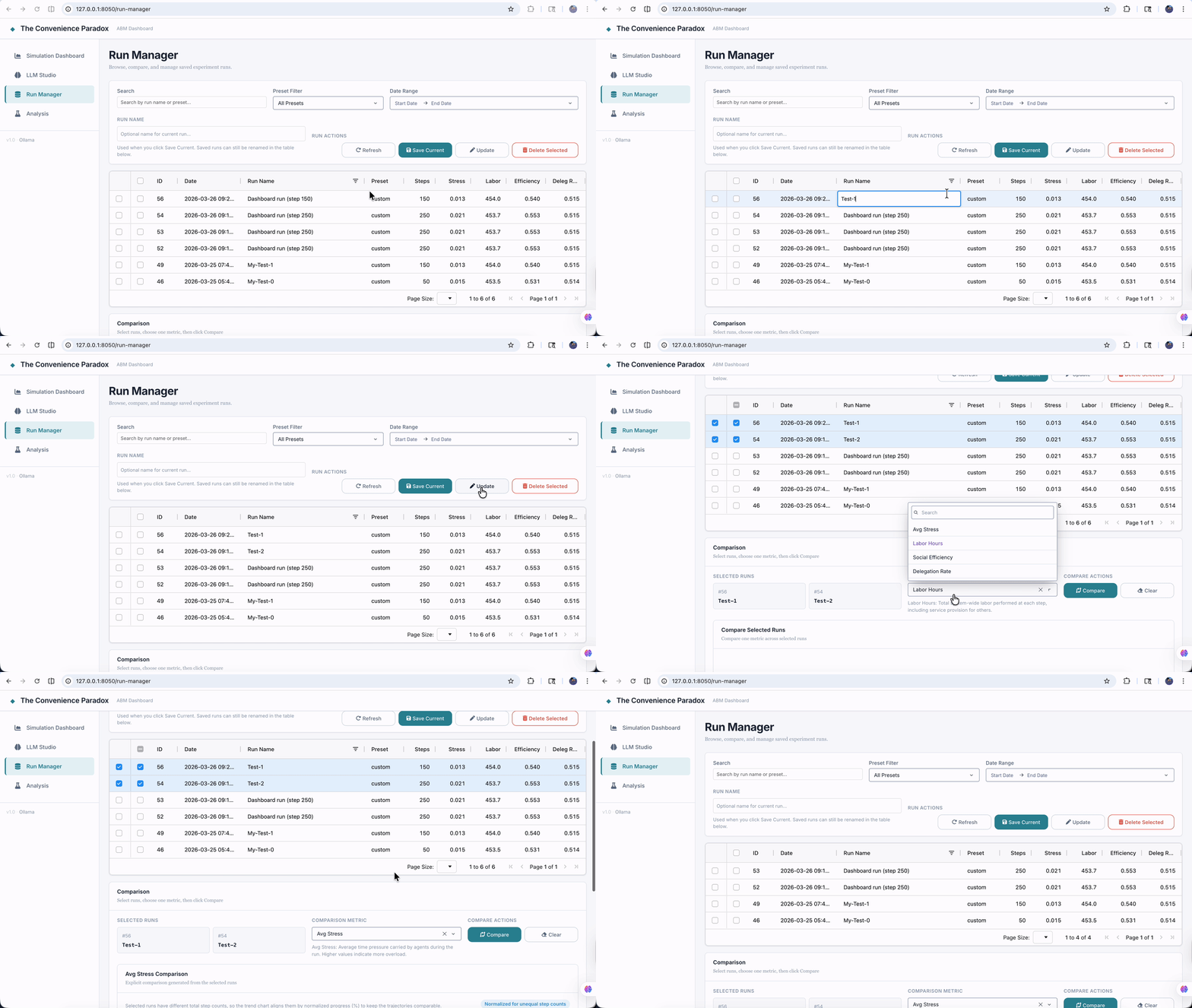
Once runs accumulate, the question shifts from “what is happening now?” to “how do these experiments compare?” The Run Manager answers that with a SQLite-backed history table, filtering controls, editable labels, and one-metric comparison overlays. It turns simulation output into something closer to a lightweight experiment database.
Analysis
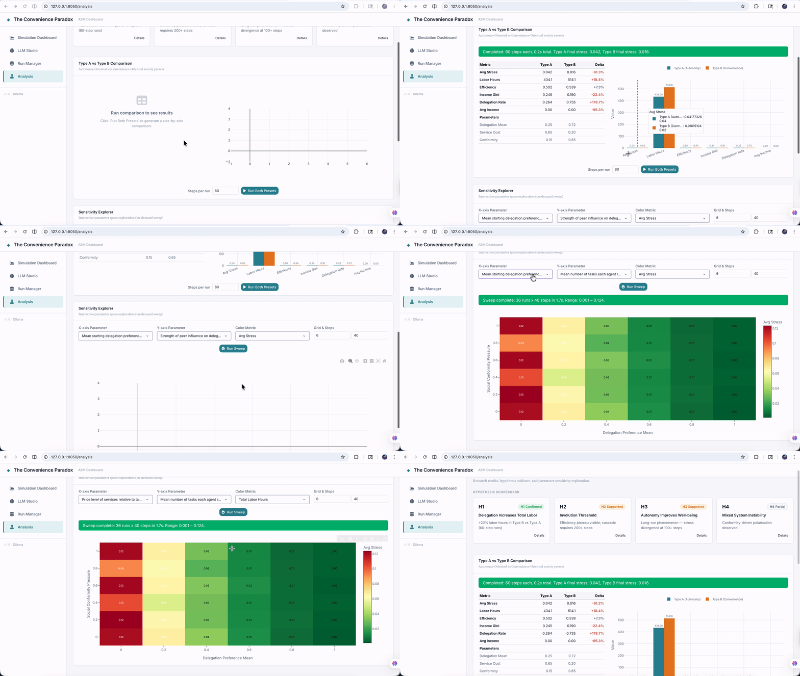
The Analysis page packages results for communication. It combines hypothesis cards, a preset-to-preset comparison workflow, and an interactive sensitivity heatmap. This is where the interface shifts from “running a model” to “presenting findings from a model” without leaving the application.
LLM Studio, Briefly
One page, however, changes the character of the whole system. LLM Studio is where the interface stops being only a dashboard and becomes a research assistant layer. It brings together scenario parsing, profile generation, result interpretation, chart annotation, experimental agent forums, per-role model selection, and a session-level audit log in one workspace. I am only naming it here, not unpacking it yet, because it deserves more than a passing mention.
The most distinctive page in the application is the one I have barely explained so far. The charts make the model visible. LLM Studio makes the interaction logic visible. That is where the design philosophy of the project becomes easiest to see, and it is the part of the interface I want to look at most closely.
Reading guide: The first three pages make the model runnable, comparable, and communicable. LLM Studio is where the interface becomes methodologically distinctive.
LLM Studio Deep Dive
If the rest of the application is about running and reading simulations, LLM Studio is about shaping the conversation between researcher and model. The page is organized as a unified workspace with role-specific tabs, a model configuration panel, staged request stores, and a session-level audit log. The interface keeps each role distinct because each role solves a different research problem and requires a different level of control.
Role 1 — Scenario Parser
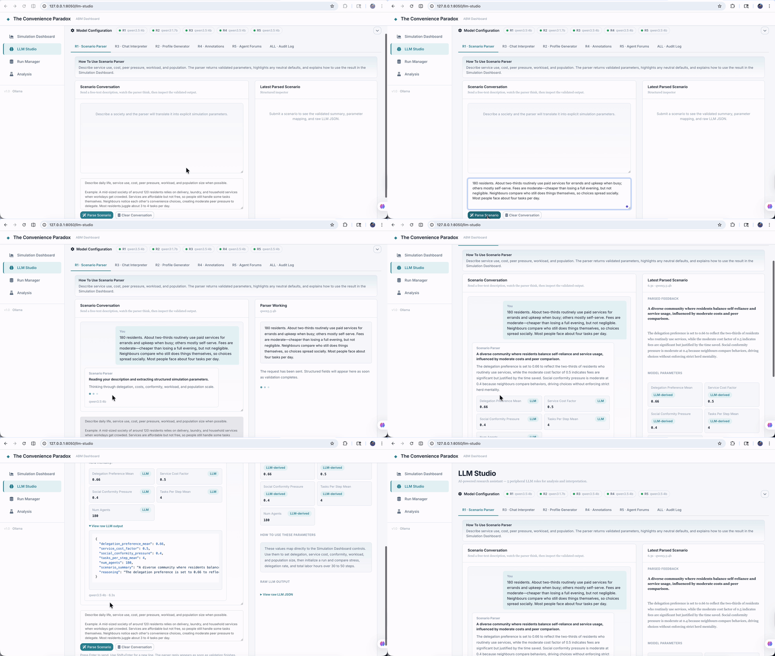
The first problem it solves is simple but important: researchers usually think in social descriptions before they think in parameter names. Role 1 gives them a place to start from natural language. In the interface, the user describes a society in plain English, the page stages a request, and the right-hand inspector returns structured values mapped onto a subset of SimulationParams. The output is not auto-applied in secret. The user reviews it and then decides whether to push those values into the Simulation Dashboard.
On the backend, api/llm_service.py calls the model with a constrained schema, and api/schemas.py defines the exact fields the model may fill. Missing values are allowed, which is a feature rather than a weakness. It means the system can admit uncertainty and fall back to neutral defaults instead of inventing precision.
The design principle here is that the LLM is translating research language into parameter language, not deciding the experiment for the user.
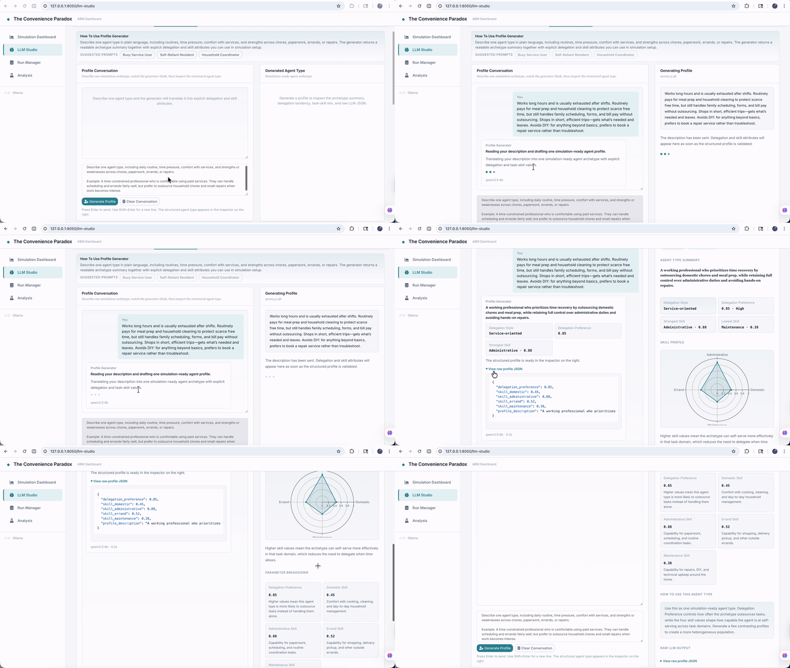
Role 2 — Profile Generator
Role 2 tackles a different bottleneck: agent heterogeneity is easier to talk about in social terms than in numeric vectors. The interface lets a user describe one agent archetype and then returns a structured profile with delegation preference and four skill dimensions. The output is immediately legible as simulation input rather than generic prose.
What matters in implementation terms is that the interface does not pretend the LLM is “being the agent.” It is generating inspectable attributes that can later be used to seed a model population. That distinction keeps the behavioral logic where it belongs: inside the Resident rules, not inside opaque dialogue.
The design principle is that LLMs are useful for constructing explicit heterogeneity, but the simulation should still run on visible rules.
Role 3 — Result Interpreter
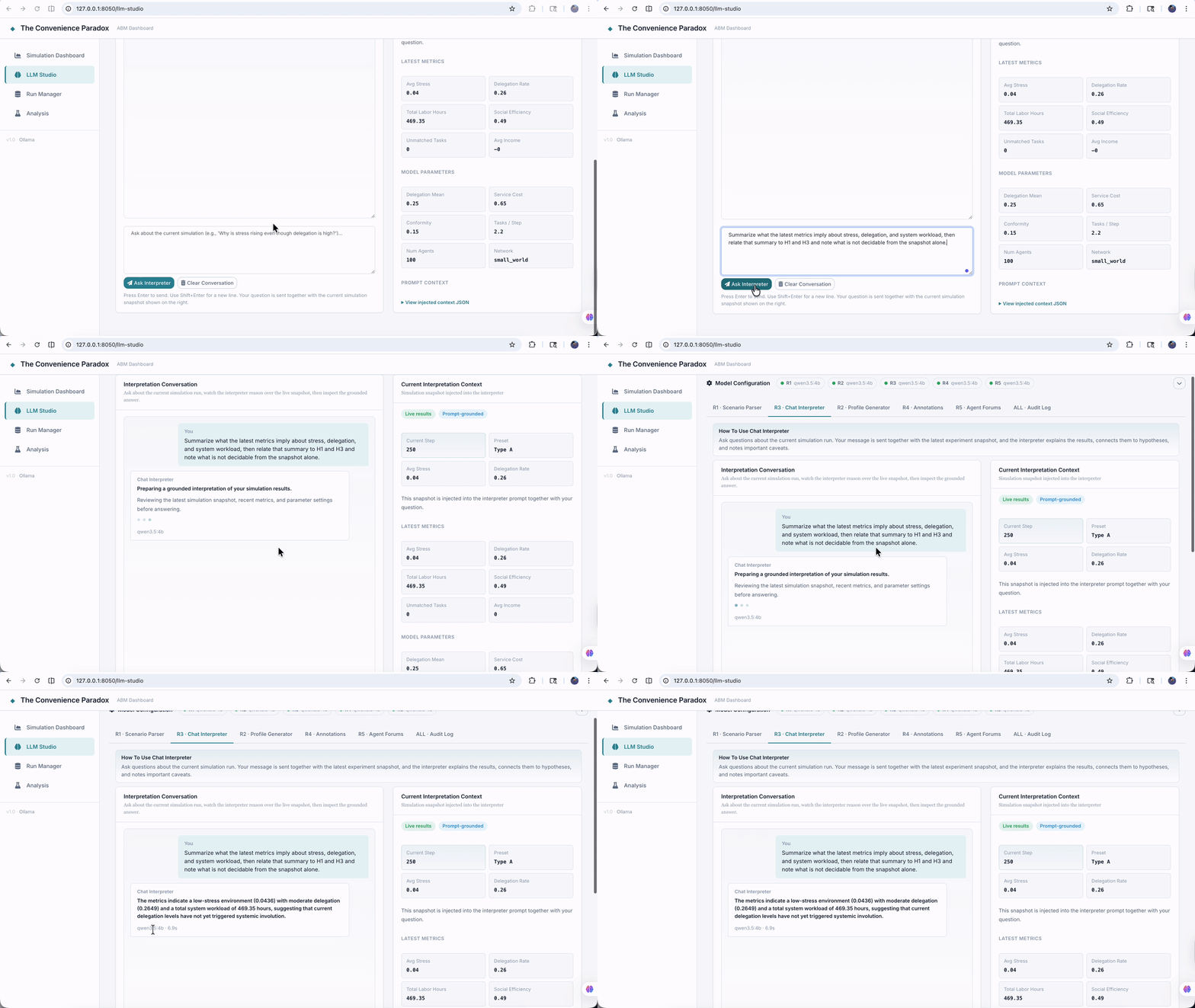
Role 3 is the most obviously conversational tab, but it is not a free-form chatbot. The user asks about the current run, and the interface bundles the question together with a compact simulation snapshot: recent metrics, current step, selected parameters, and conversation history. The returned answer is structured into a concise response, a fuller explanation, a hypothesis connection, and a confidence note.
That shape matters. It forces the interpretation layer to stay tied to the current experiment and to acknowledge methodological limits when needed. In other words, the role is not rewarded for sounding clever. It is rewarded for reconnecting visible metrics to explicit hypotheses and for stating caveats when a conclusion is still unstable.
The design principle is mechanism-oriented interpretation: use language to make results more legible, not to smuggle in a new causal theory.
Role 4 — Visualization Annotator
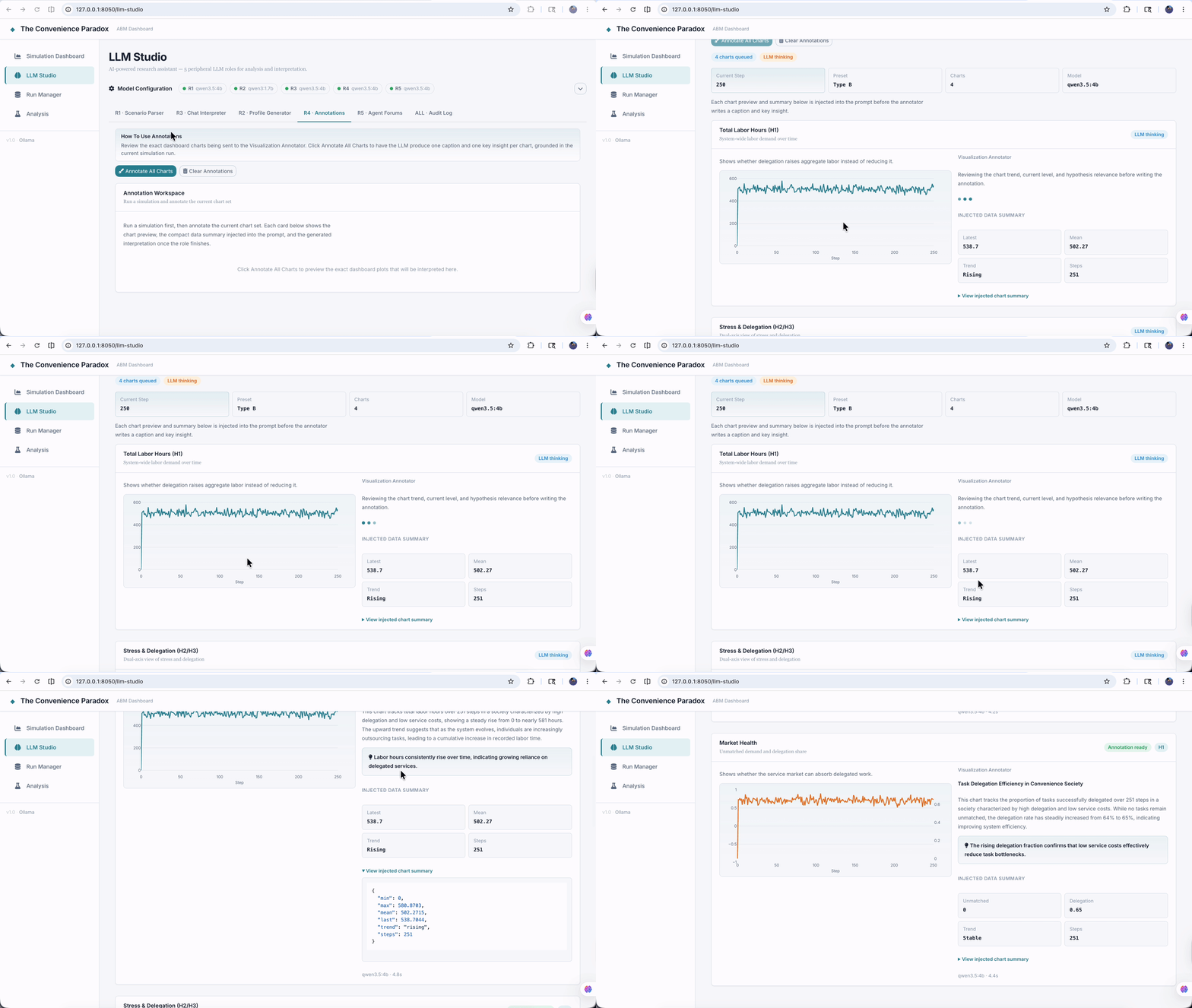
This role exists because charts rarely explain themselves. A line can rise, flatten, or split for many reasons, and a research interface should help a reader reconnect the picture to the underlying mechanism. In the UI, the user can annotate all charts at once and watch cards fill in chart by chart.
What happens behind the scenes is the key design move: the program first computes summary facts from the chart data, and only then asks the LLM for a caption and one key insight. That ordering is crucial. The LLM is not deciding what the data says. The code computes the facts; the LLM translates them into clearer language.
The design principle is facts first, language second. That sounds modest, but it is exactly the kind of boundary that makes LLM integration usable in research settings.
Role 5 — Agent Forums
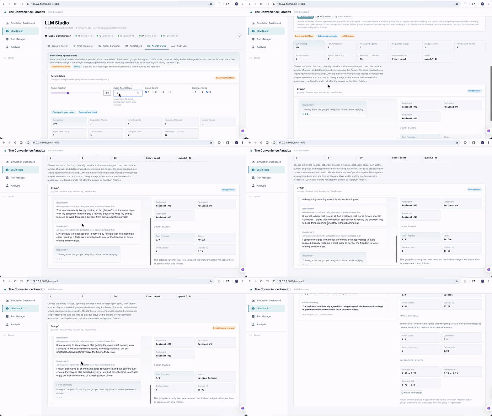
Role 5 is where the project becomes methodologically ambitious. Standard simulation runs keep norm adaptation fully rule-based. The forum mode introduces a deliberately bounded gray-box experiment: a sample of agents joins short small-group discussions, the system extracts a norm signal from each discussion, and that signal can nudge delegation preference by a capped amount.
The interface makes the experimental status impossible to miss. The tab is labeled Experimental Mode. The user controls forum fraction, exact or derived participant count, group count, and dialogue turns. The result is not a hidden update to the model state. It is a visible transcript workspace with group status, dialogue turns, extracted summaries, confidence values, and preference updates.
The backend logic in model/forums.py is equally explicit. The dialogue is short. The extracted outcome is structured. The update uses delta = norm_signal * confidence * NORM_UPDATE_CAP. Full audit visibility is preserved. That is what allows the role to exist without undermining the rest of the model. The project is not claiming that the LLM now is the social mechanism. It is testing whether a carefully bounded language layer changes the dynamics in a measurable way.
The design principle is controlled gray-box experimentation: if an LLM enters the loop, its influence must be limited, labeled, and inspectable.
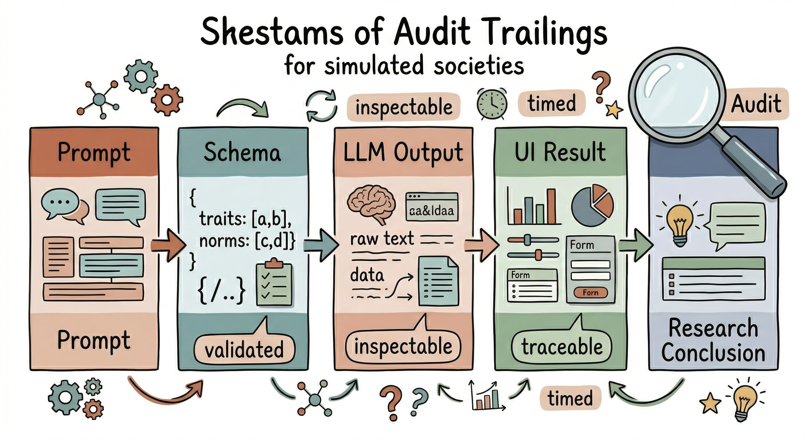
Across all five roles, one feature ties the page together: the audit log. Every role leaves behind a visible trace of model choice, timing, prompt payload, and result payload. That is not just a debugging convenience. It is the interface embodiment of a broader methodological stance: if LLMs are going to participate in the research workflow, their participation should be reviewable.
Methodological rule: If an LLM participates in the workflow, its contribution should leave a visible trace.
Closing
What I wanted from this project was not just a nicer way to look at simulation output. I wanted an interface that could operate as part of the research method itself: configure scenarios, expose model behavior, manage runs, present findings, and integrate LLM assistance without surrendering the white-box clarity of the underlying ABM.
That is why I think of this application less as a dashboard and more as a small piece of research infrastructure. The simulation engine, GUI layer, visual analytics, LLM roles, and audit mechanisms are doing different jobs, but they are organized around one common task: helping a researcher move from question to experiment to explanation without losing sight of the assumptions in between.
If there is one lesson I take from building it, it is that interface design is not secondary to computational modeling. In projects like this, the interface is where transparency either survives or disappears. A good research interface does not simply make complex systems look better. It makes them easier to question. And in that sense, it is still doing what I care about most: making the invisible visible.
Bottom line: In this kind of project, interface design is part of the method. It is where transparency either survives or disappears.
This project explores abstract social dynamics and is not intended to characterize or evaluate any specific society, culture, or nation.